Redesigning Buzzfeed
Project Outline: Improve Buzzfeed’s current website by reducing overcrowded imagery and content with a redesign.
Time: 2 week sprint
Role: Independent Researcher, UX/ UI Designer
The Problem
The problem with Buzzfeed’s current website is that users are overwhelmed with excessive content and imagery.
The Solution
Tools: Sketch and Keynote
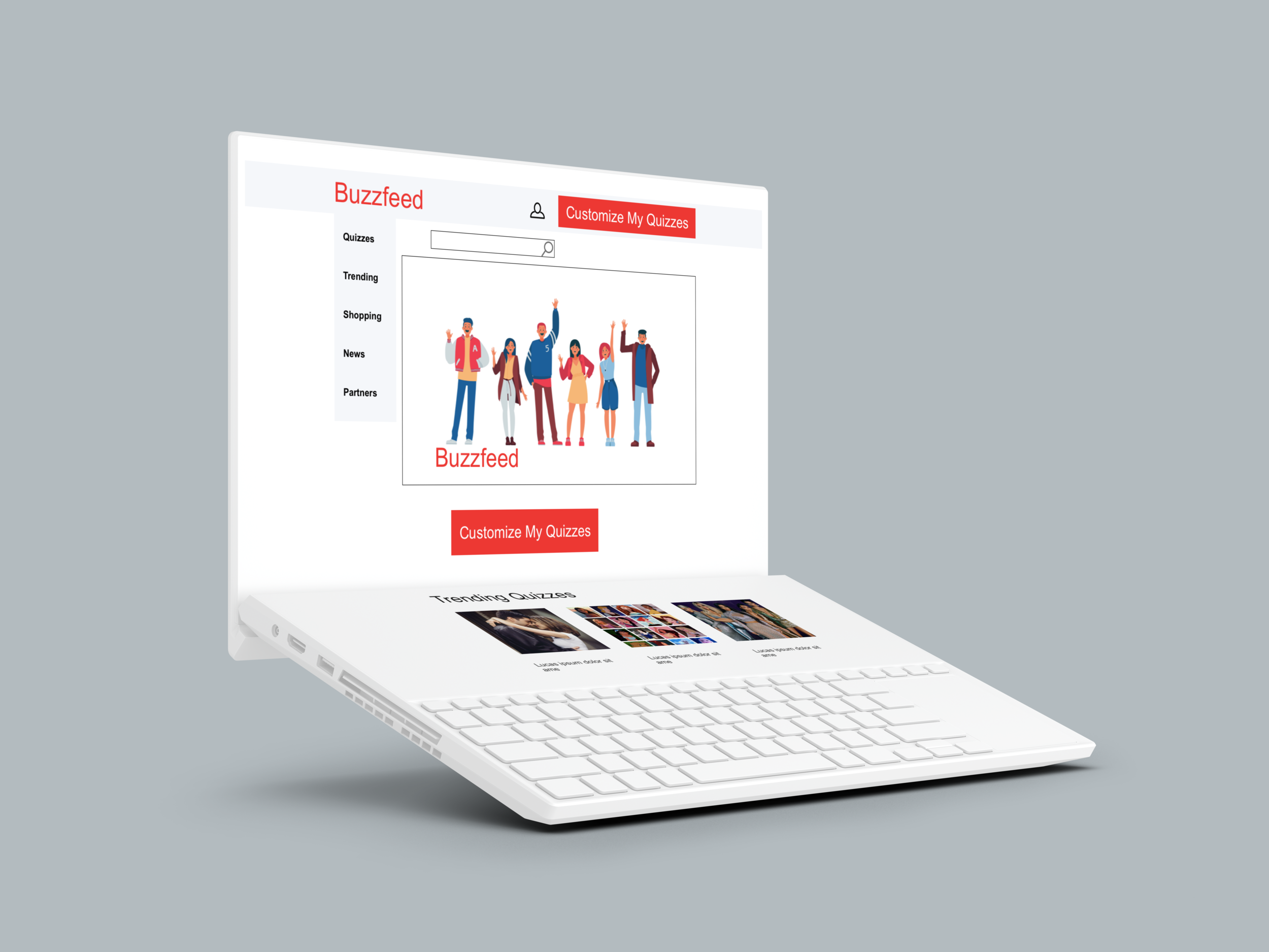
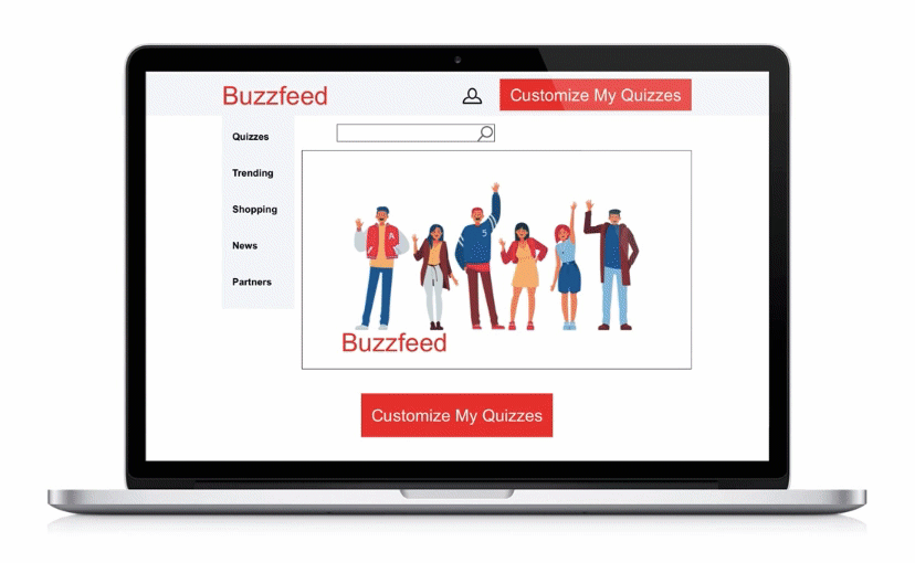
I created a minimalistic aesthetically pleasing desktop website to improve user experience. In addition to reducing content overload, I also added a “Customize My Quizzes” feature.
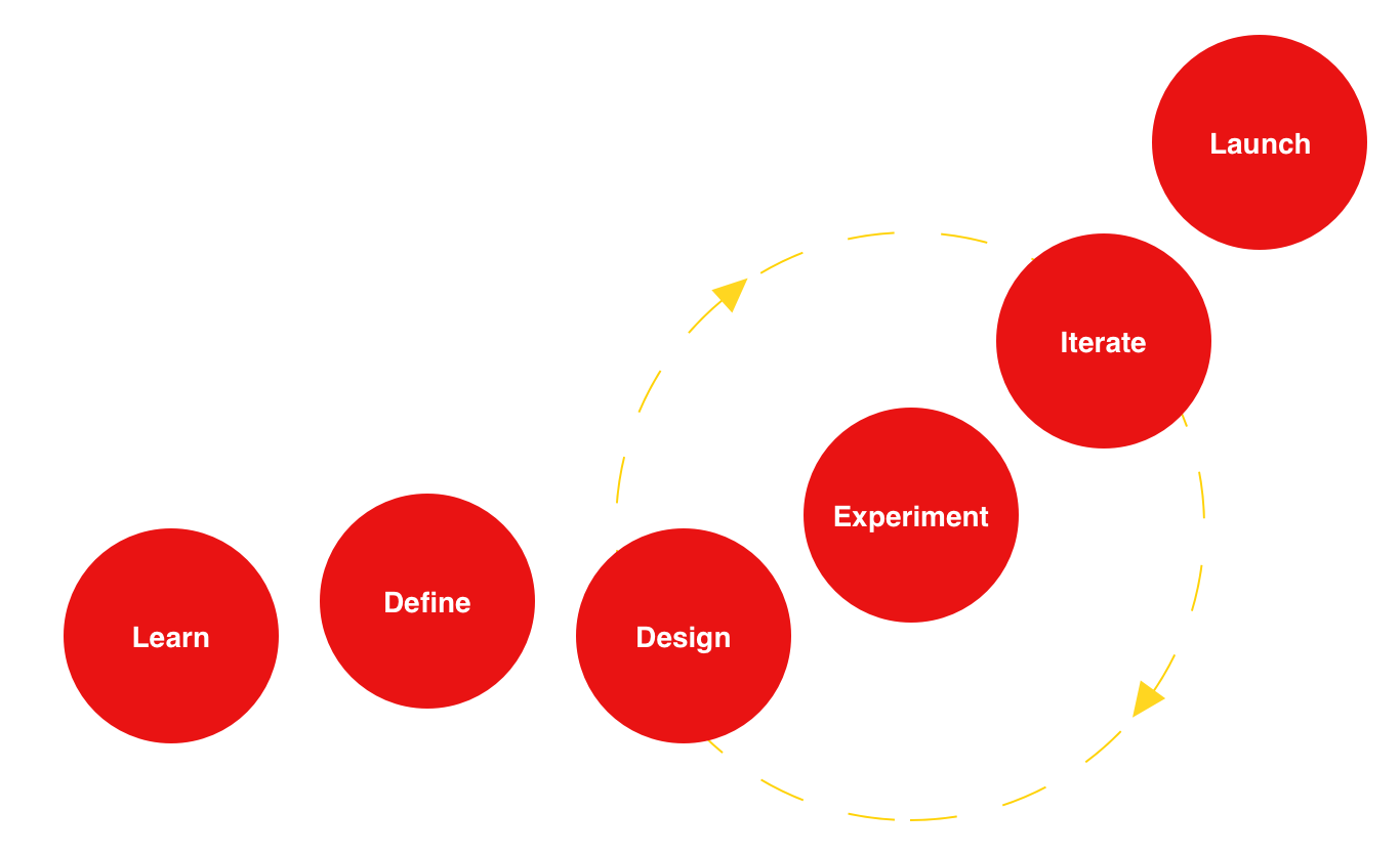
The Framework
This is my ux/ui design process inspired by Design Thinking and Lean UX. In these phases, I am conducting field and desk research, understanding my customer, breaking down and visualizing ideas, experimenting with prototypes, entering feedback loops and then ultimately building and launching the redesign of Buzzfeed.
Learn
The learn phase of UX design unpacks the brief, inspires us, and allows us to empathize with users and get to the heart of overlapping needs of the business and user, as a result solving a problem.
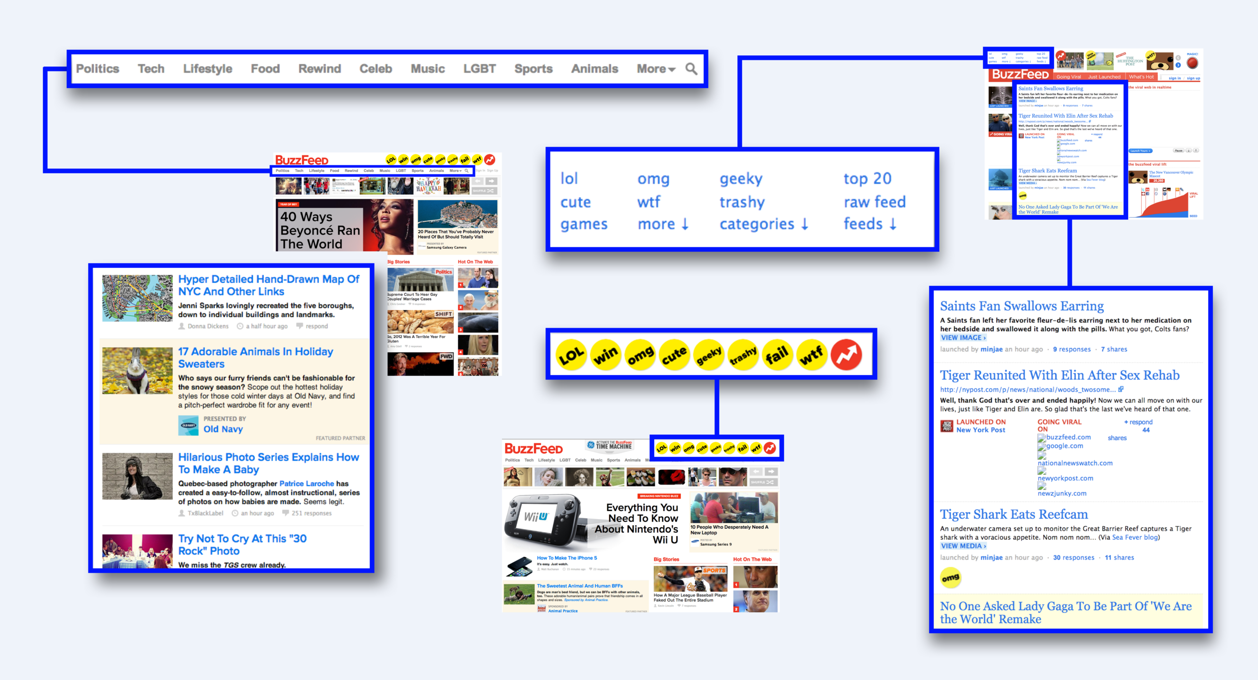
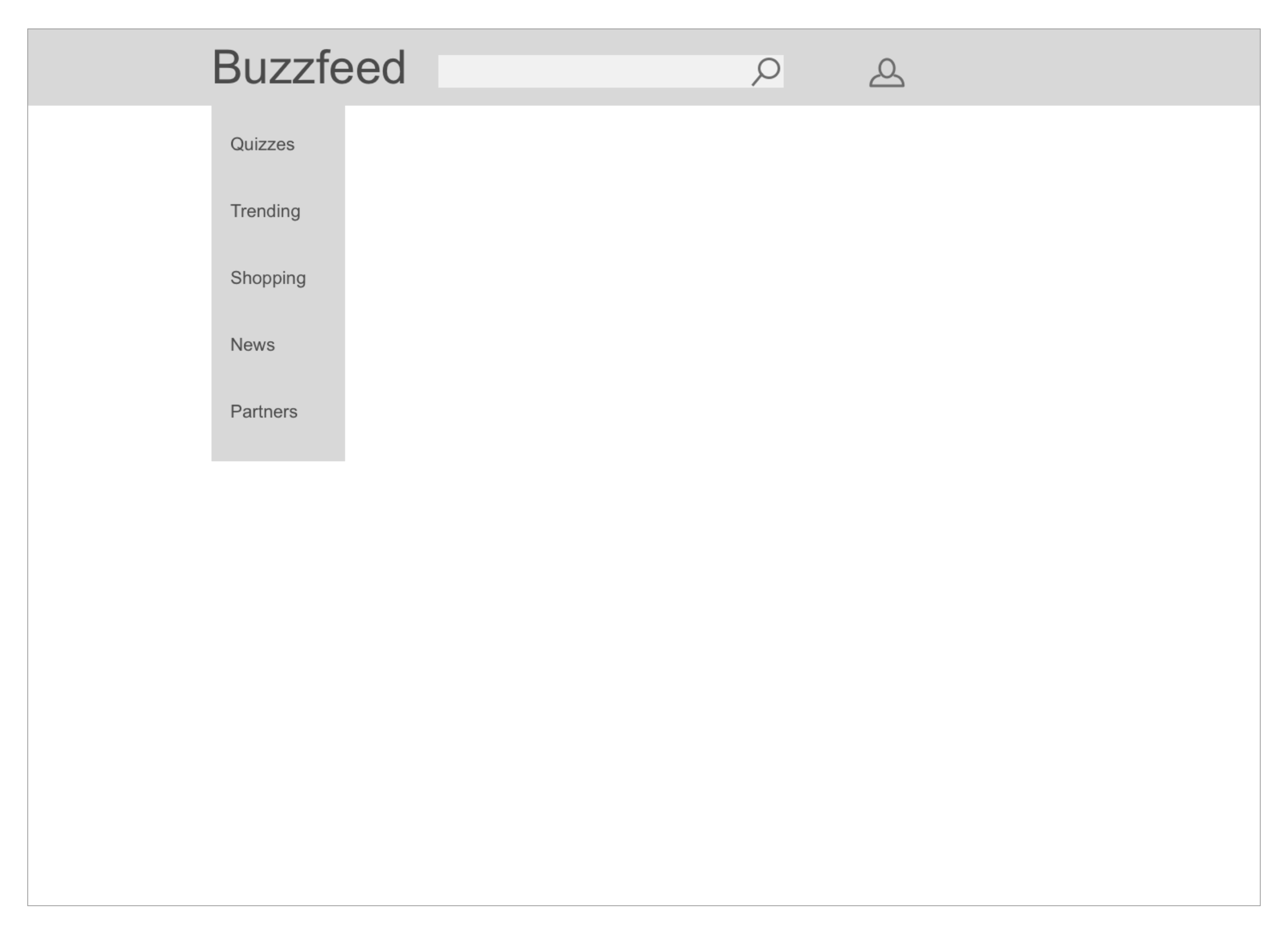
Buzzfeed’s Navigation
Tools: Google Slides and Sketch
What is Working and what needs work?
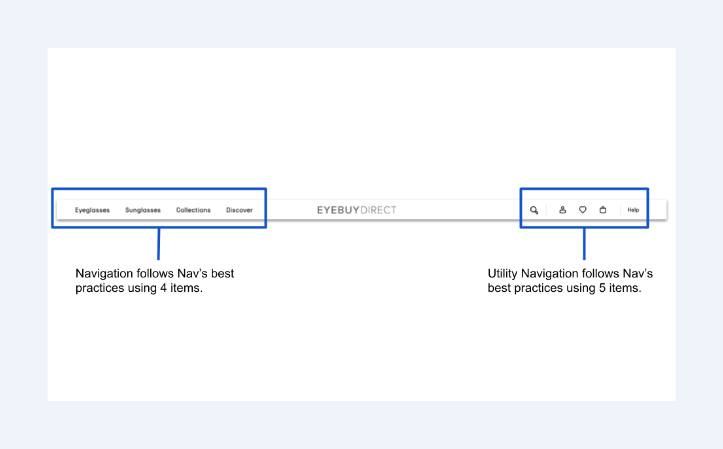
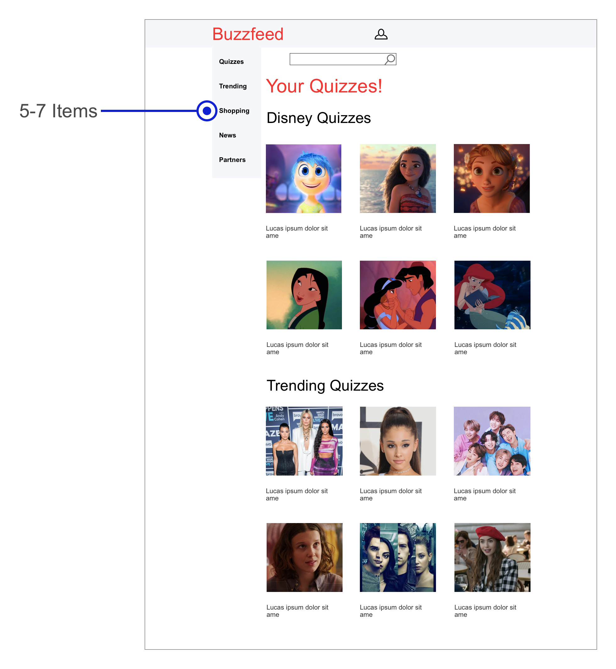
Pro: 1. Buzzfeed’s navigation follows navigation’s best practices of having 5-7 items.
Needs work: 1. Best practices is to not display hamburger menu on websites.
2. There is too many repetitive icons in the sub navigation.
3. There does not seem to be a function or purpose for these symbols.
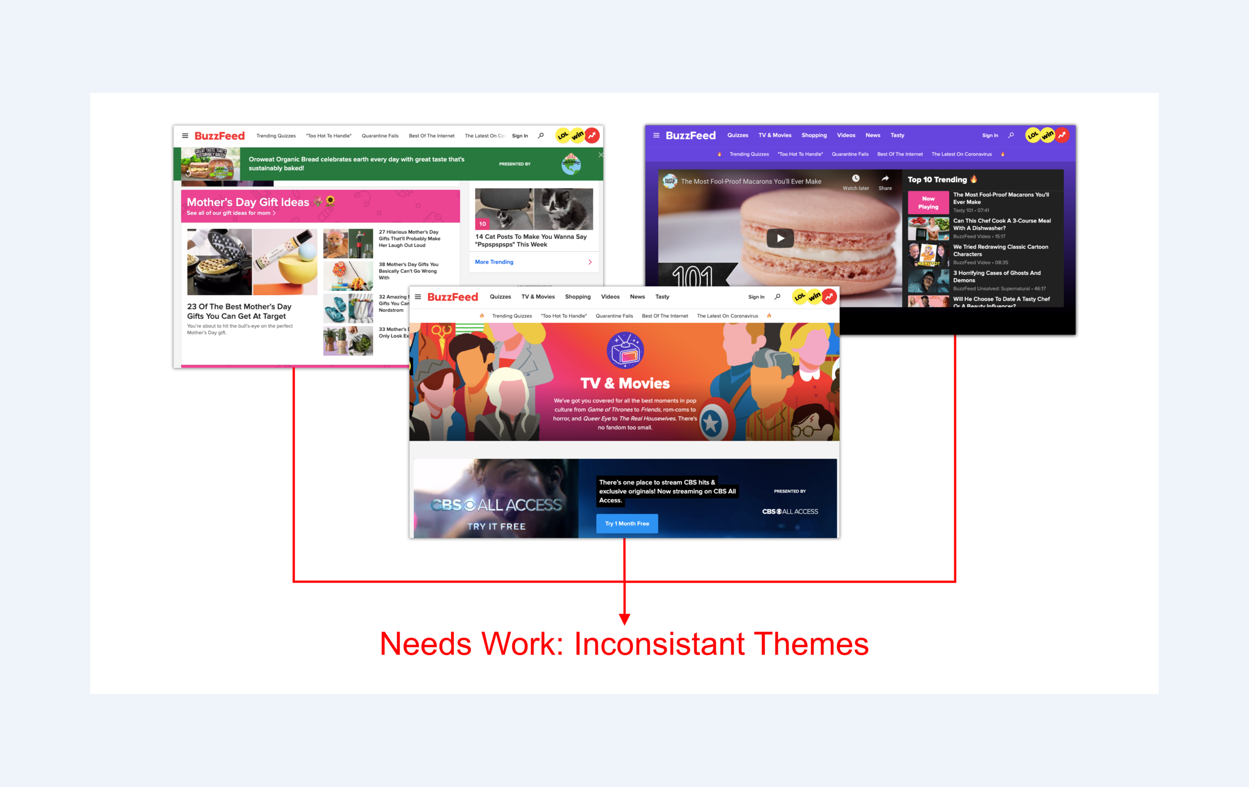
Buzzfeed’s pages all have different colors and do not have a consistent theme.
Takeaway : We should look into making theme more consistent.
Buzzfeed’s Theme
Tool: Sketch
Competitive Audit
Competitor’s Nav
Tools: Google Slides and Sketch
A competitive audit helps me track where my competitors are and what makes them more visible online.
The navigation is simple and clearly following Navigation’s best practices to use 5-7 items max.
Each page has a consistent theme throughout the website.
Competitor’s Theme

Tools: Google Slides and Sketch
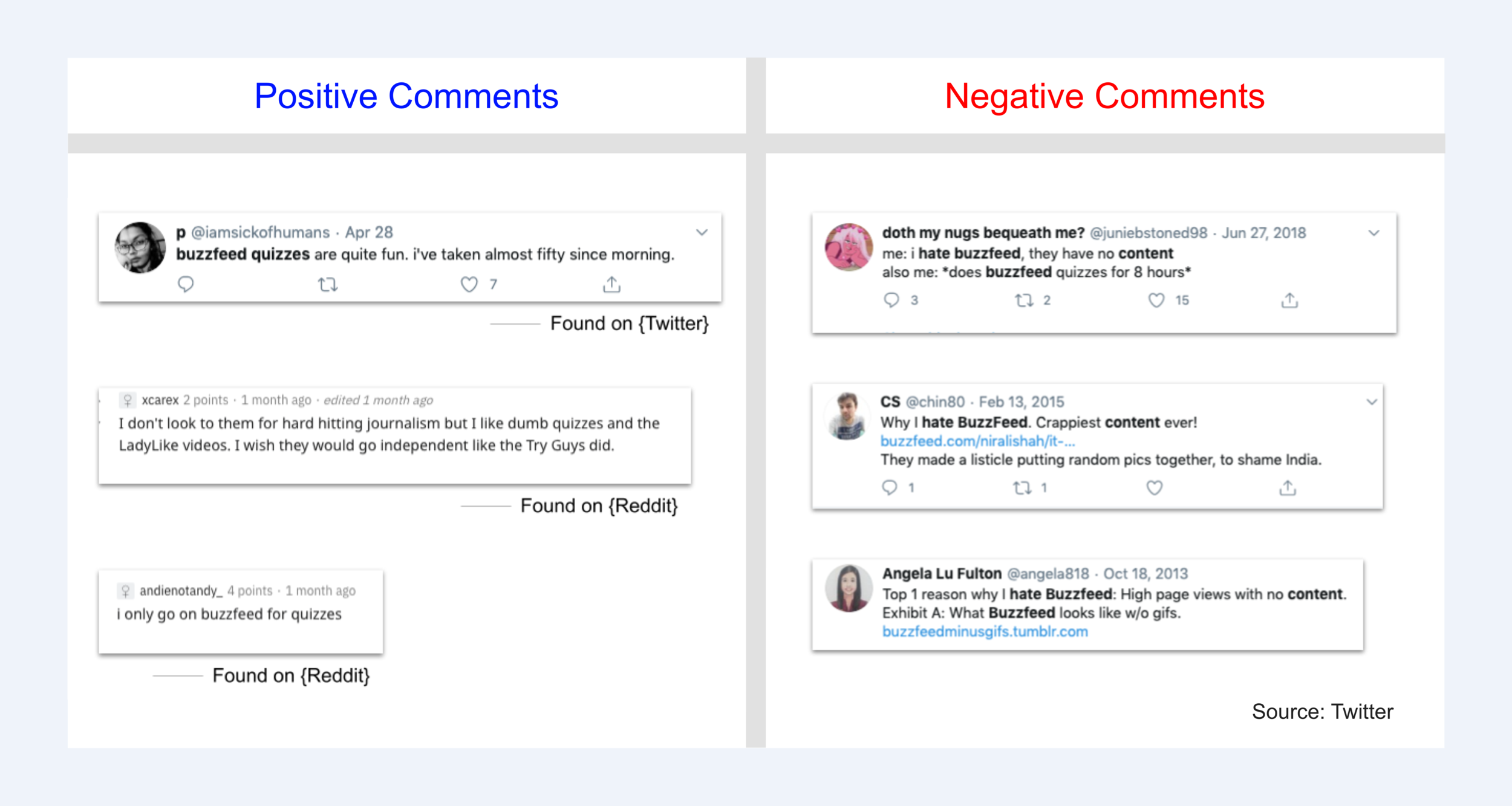
Social Listening
Social listening helps give feedback about the user experience.
Tools: Google Slides and Sketch
Takeaway: Consumers love the Buzzfeed quizzes but also want trusted content and content they can enjoy.
Data
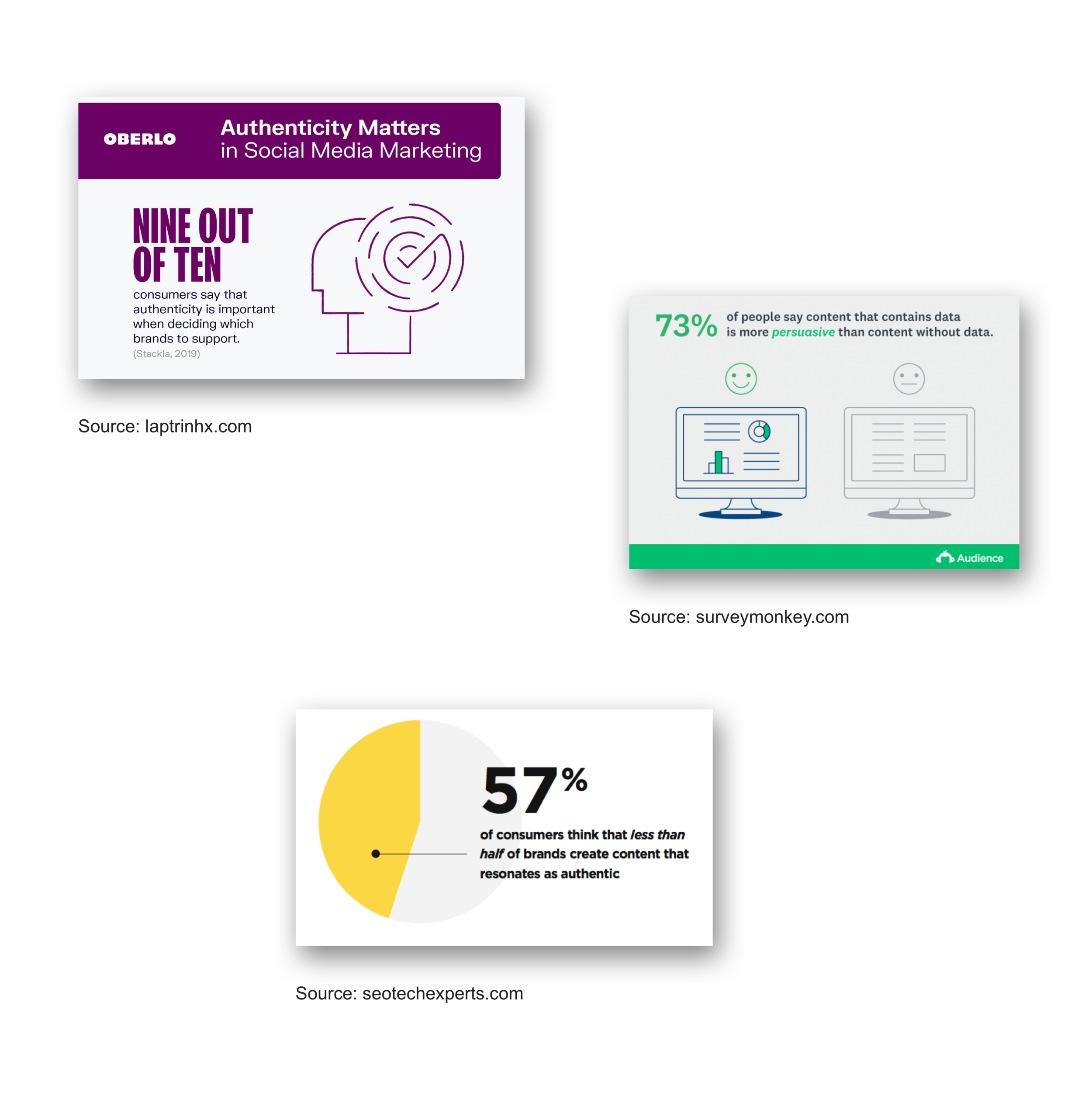
Takeaway: Consumers want authentic content with data.
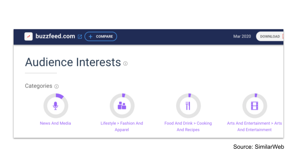
Takeaway: These categories are important to keep in the navigation as these items are what the audience is interested in.
Define
In the define phase, we identify our goals, objectives, and strategy for the UXUI.
Problem Statement
Buzzfeed.com is intended to achieve user engagement and to stay on top of the latest trends.
We have observed that Buzzfeed isn’t meeting user’s engagement which is causing the business to get a bad rep and is increasing the drop off rate. How might we improve Buzzfeed.com so that our customers are more successful based on conversion rates through sign ups?
Information Architecture
Information Architecture is the blueprint of the design structure. This organization helps users navigate complex sets of information.
Lo Fidelity Sitemap
Hi Fidelity Sitemap
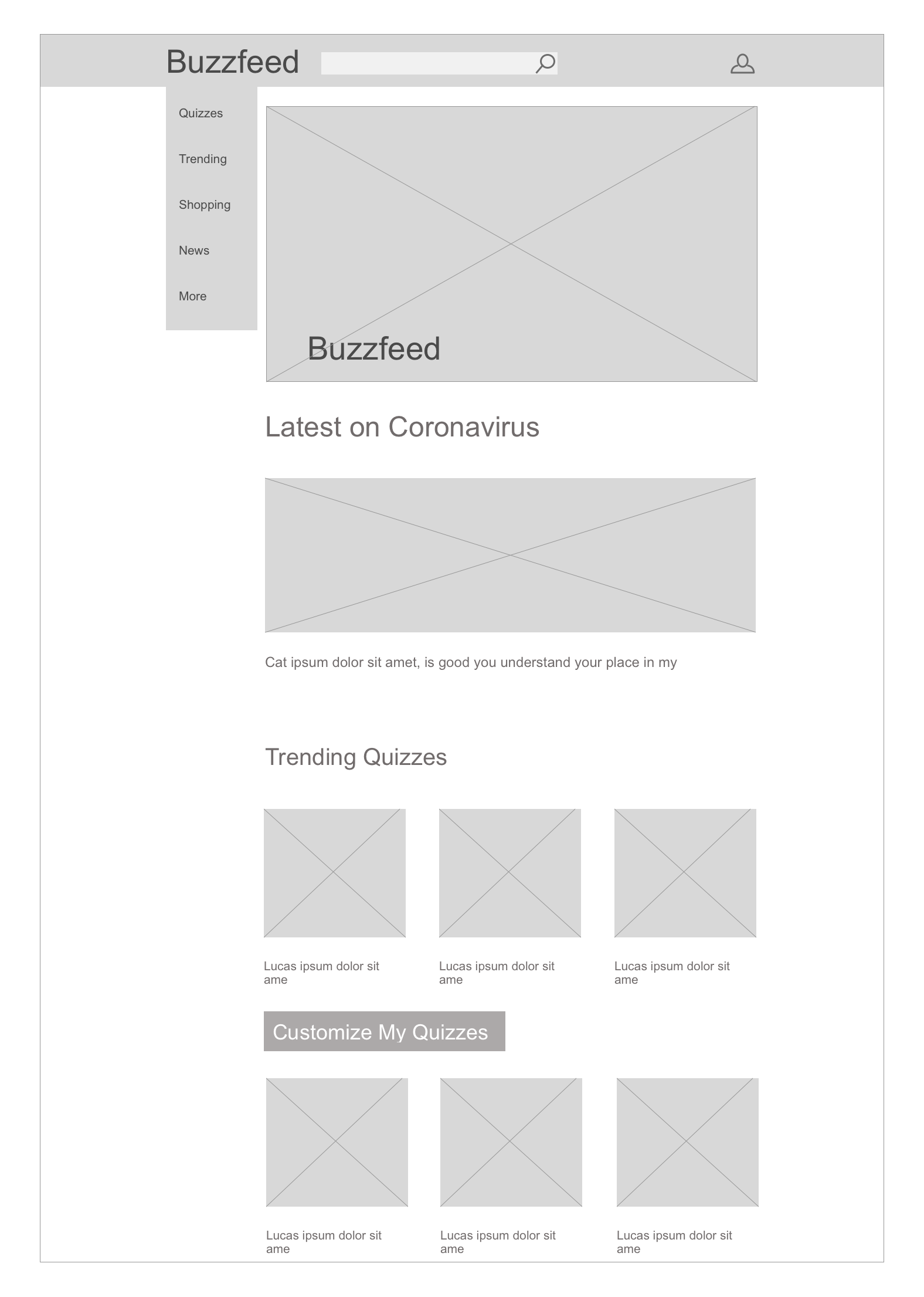
There is an excessive amount of content that also repeats.
Continuing Sitemap of Trending Bar
Tools: Sketch
Trending bar adds more content for the user to be overwhelmed with.
Proposed Sitemap
This site map is less condensed so that the user can easily navigate through the site.
User Flow
Tools: Figma
There are too many steps for the user to take a quiz.
Proposed User Flow
This user flow has less steps to take a quiz and also a customizable quiz option for users to be more content with.
Design
Sketches
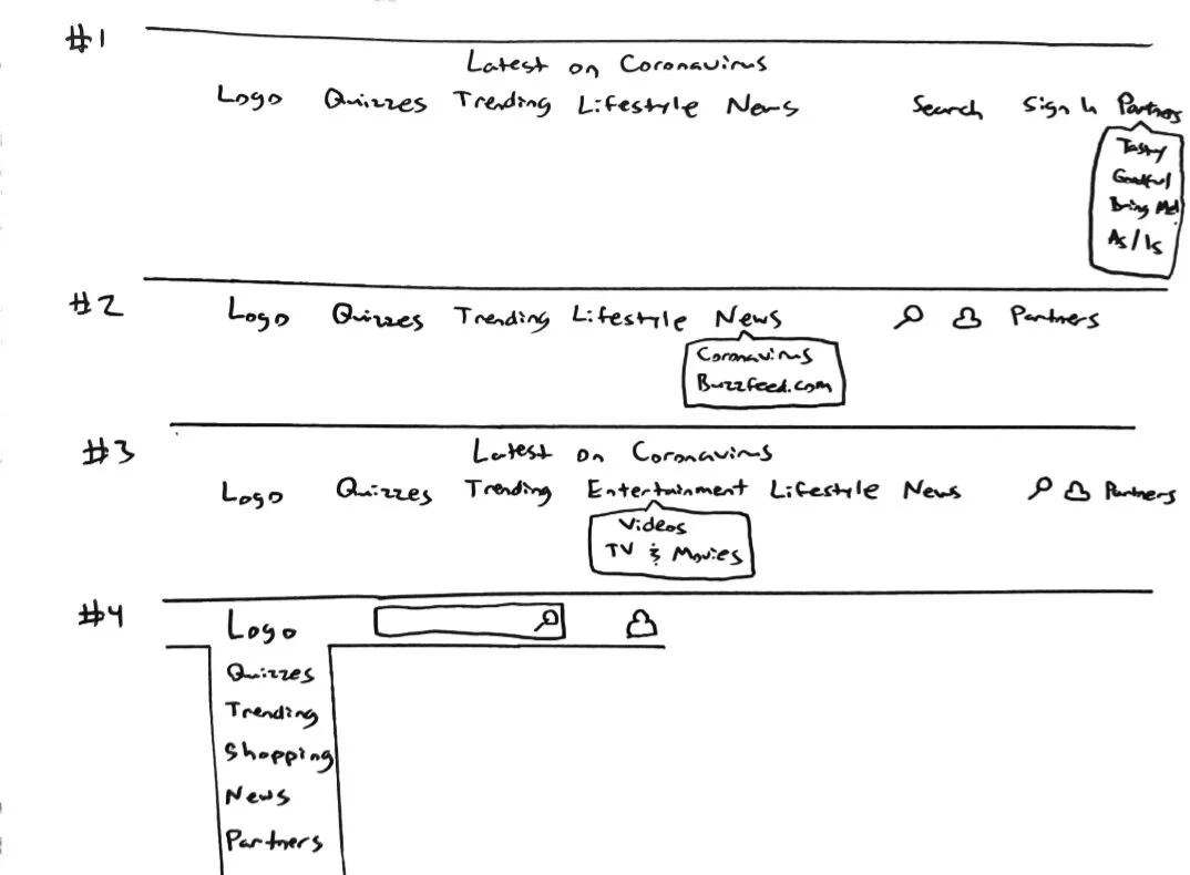
Nav Sketches
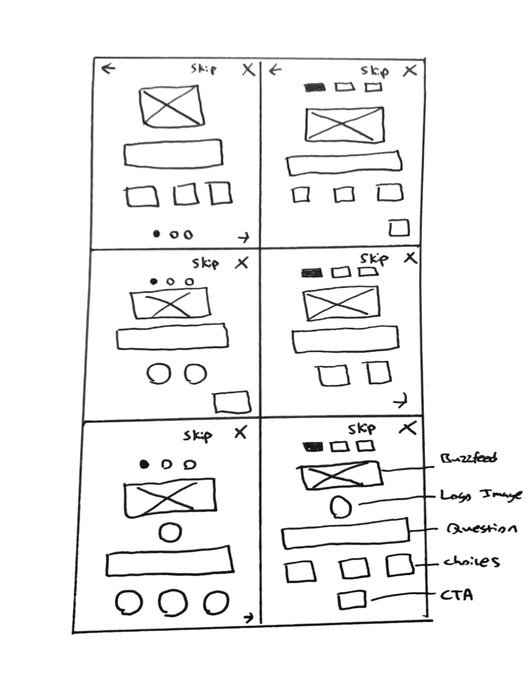
Quiz Sketches
Wireframes
Tools: Sketch
Navigation Option Wireframes
Tools: Sketch
Mockups

Tools: Sketch
Experiment
Test Plan: Thoughts on a vertical navigation?
“Wow! This is different from Buzzfeed’s current navigation. I think I like it.”
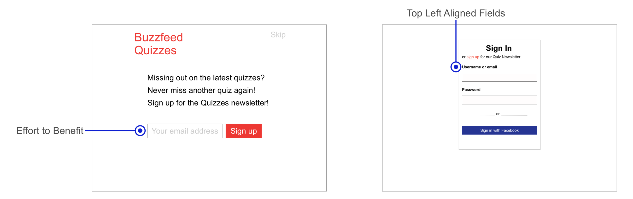
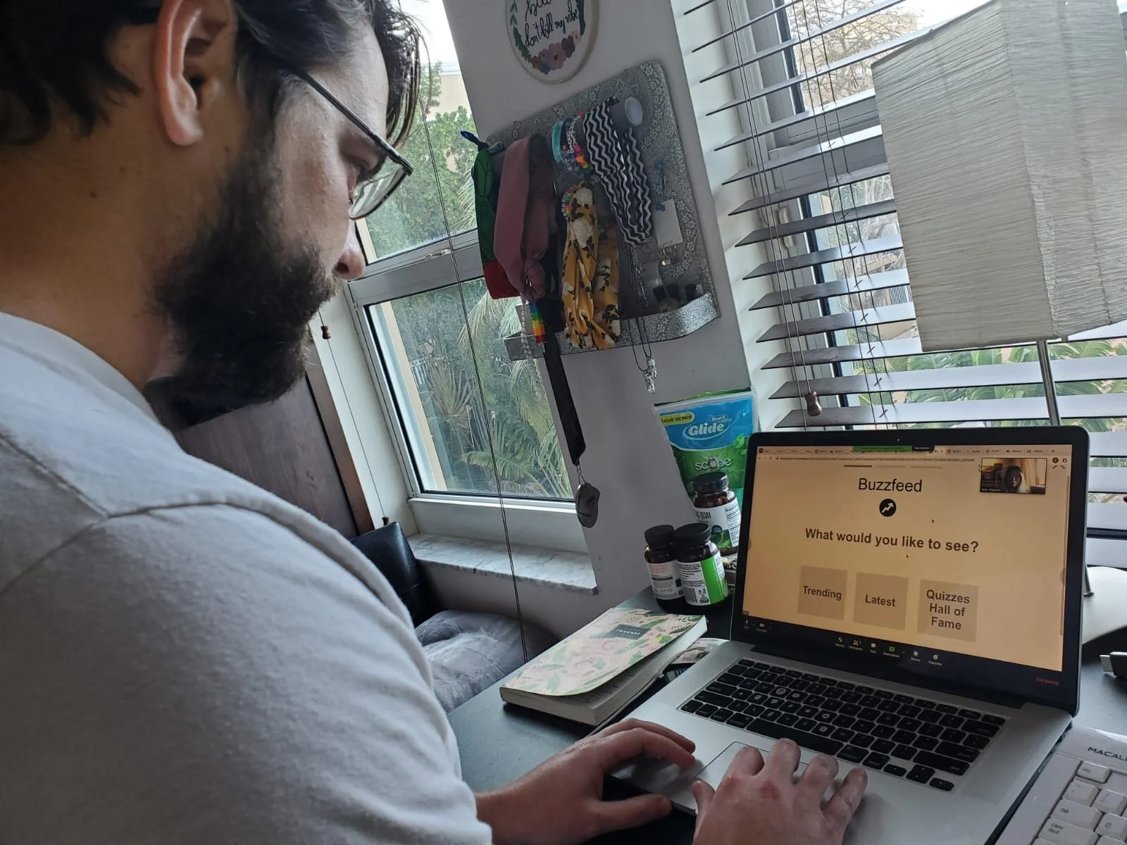
Test Plan: Where to find “Customize My Quizzes” CTA?
“I don’t see that button.”
“It’s not obvious where to find it.”
Test Plan: A/B Testing on Quiz Option Wires
Tools: Sketch
“Quiz B looks more simple, and I like that one.”
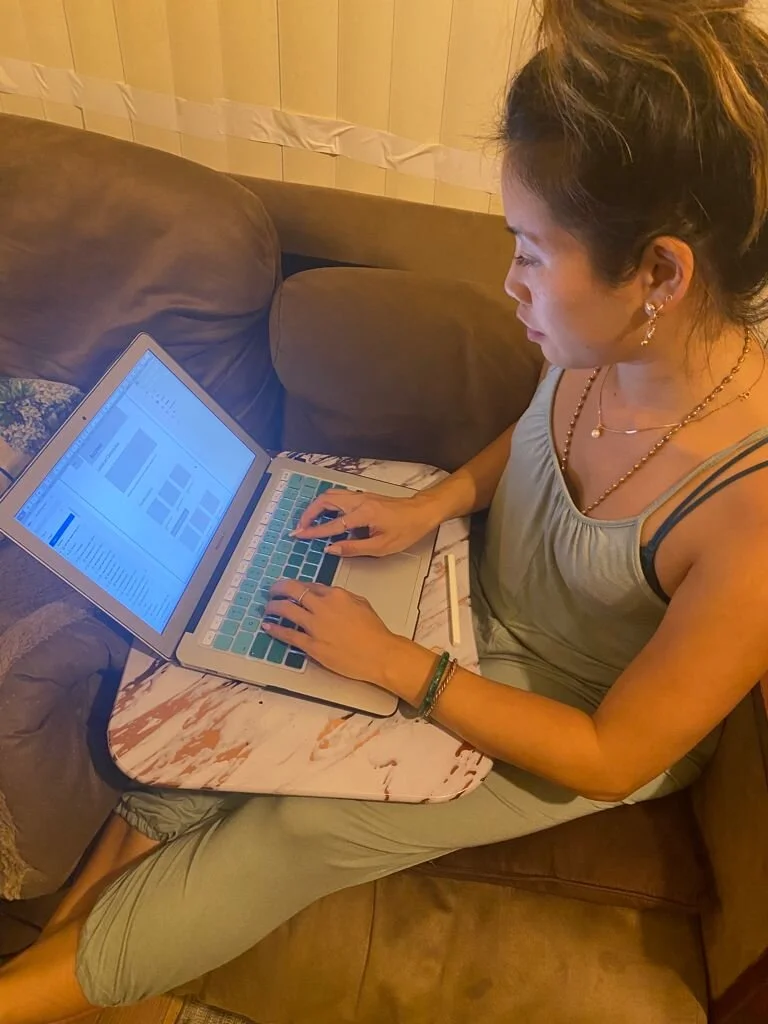
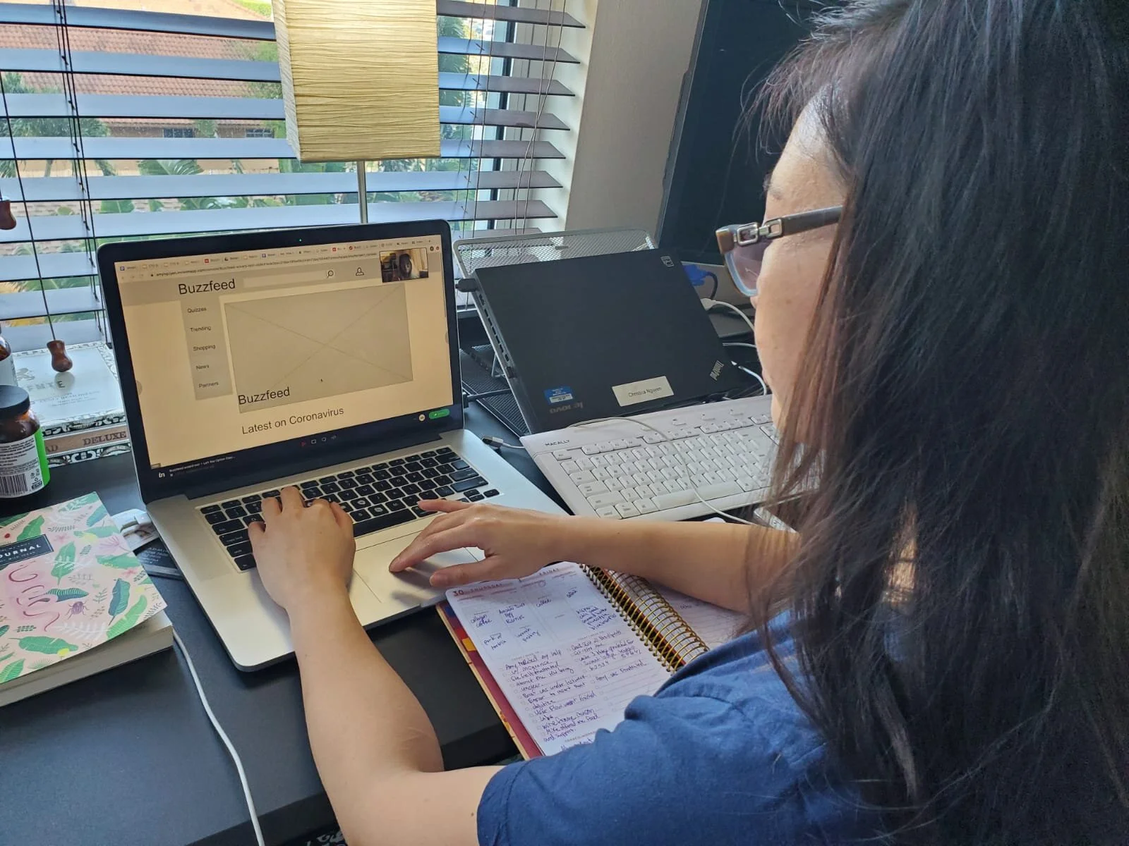
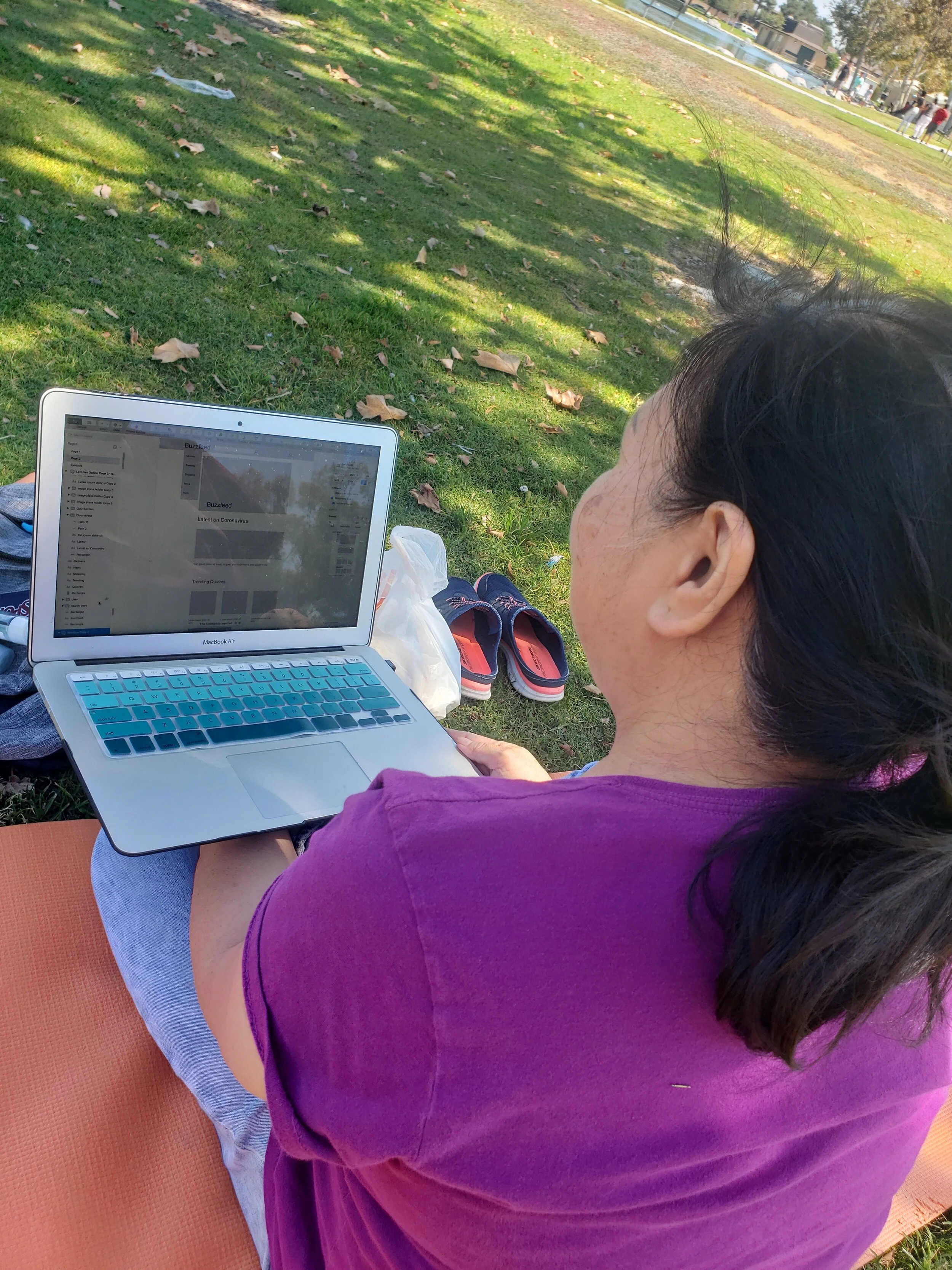
The User Testers

Iterate
Thoughts on Vertical Navigation
3/5 users liked the vertical navigation; so I decided to keep this navigation in the mockups with minor changes.
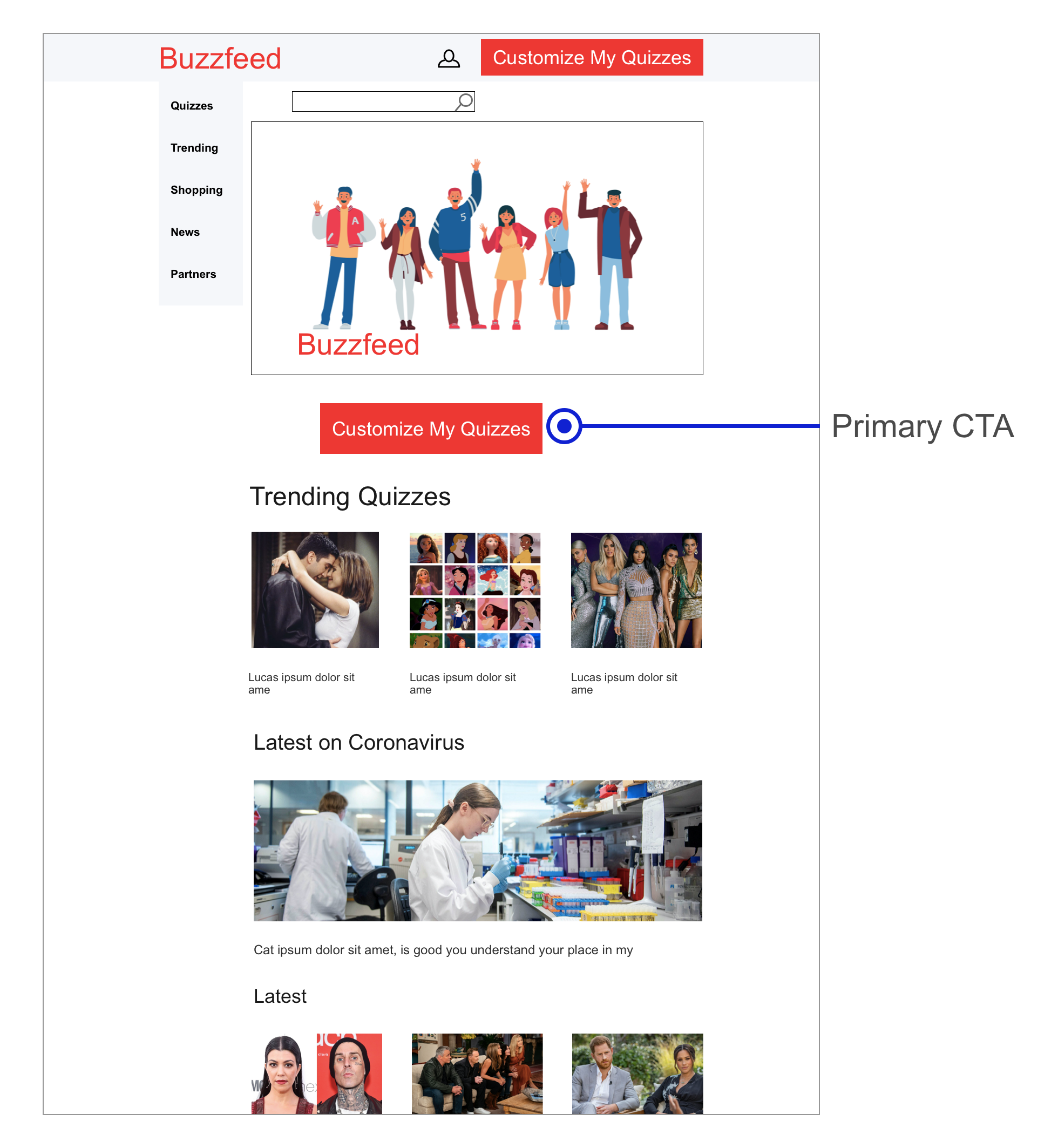
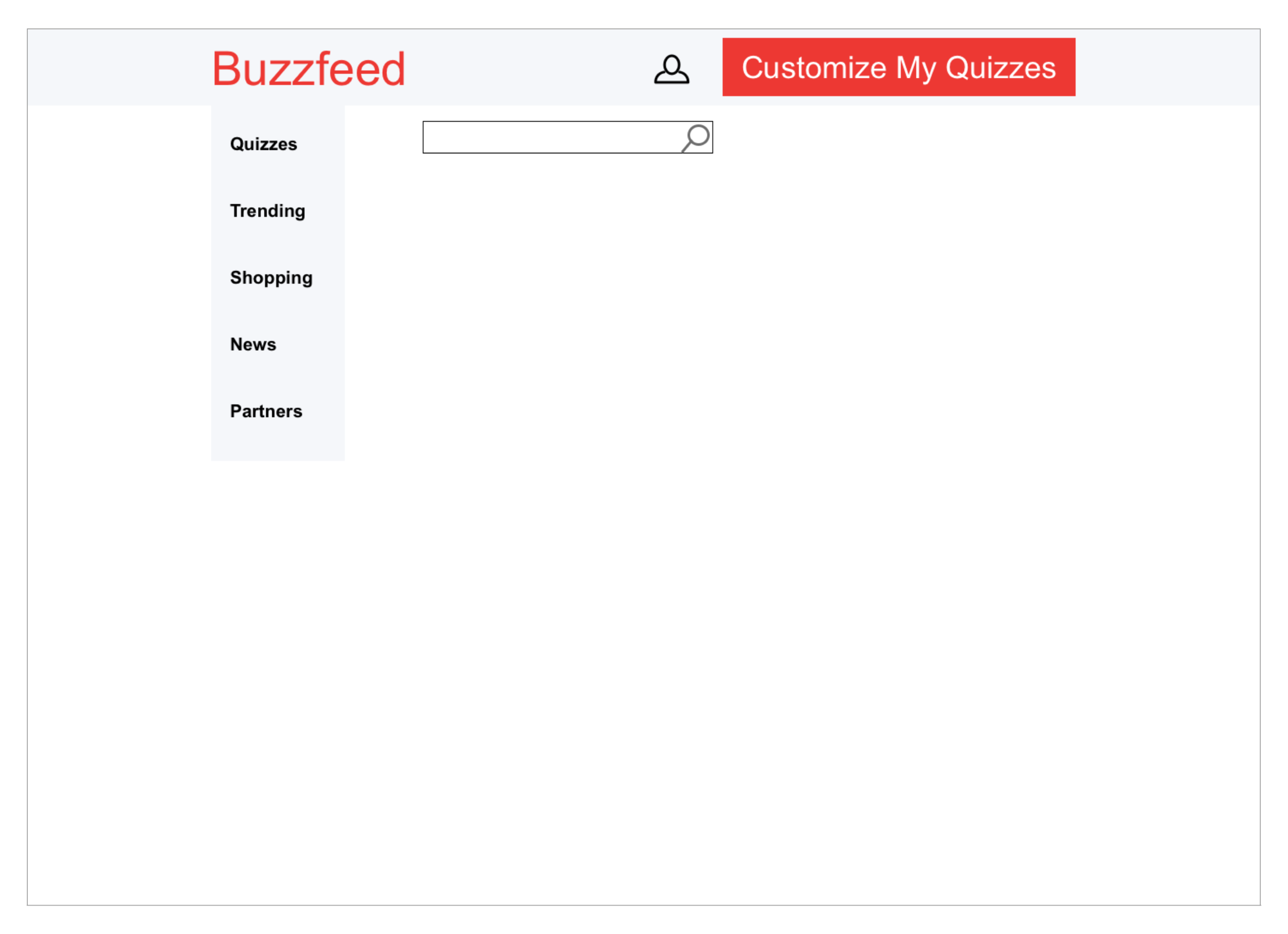
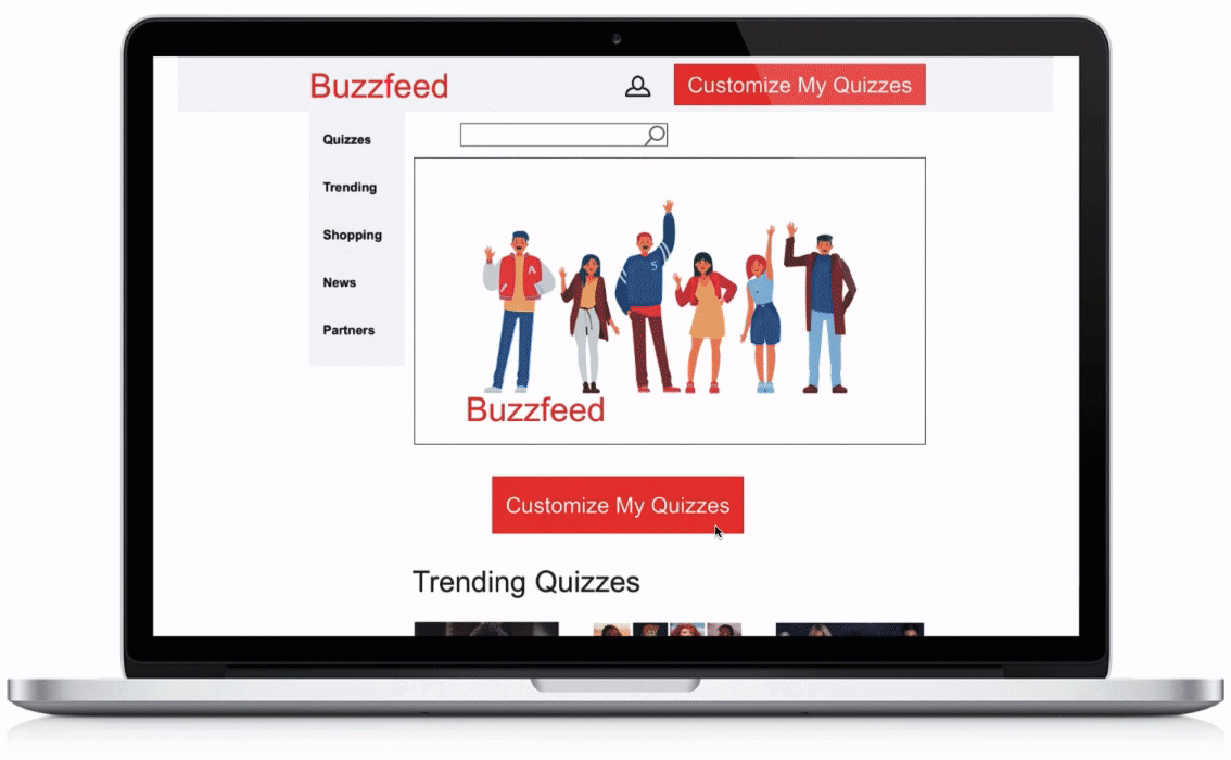
“Customize My Quizzes” CTA
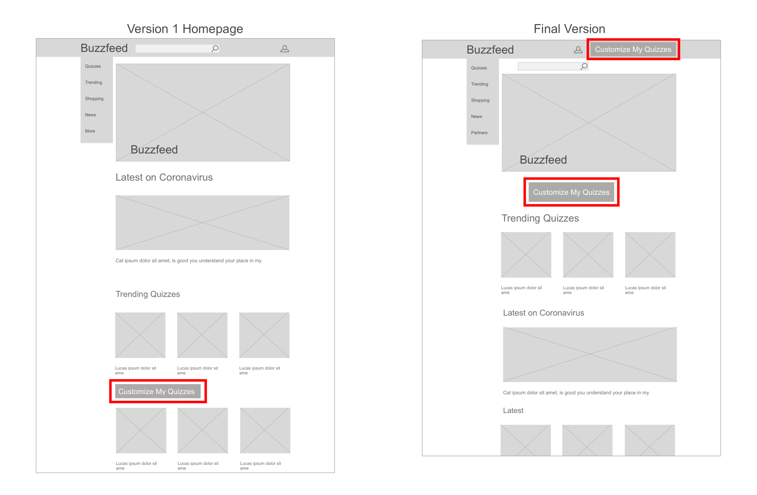
5/5 users needed the “Customize My Quizzes” CTA to be more visible. As a result, I moved the CTA higher to be shown before the scroll and also in the navigation.
Homepage Wireframe Versions
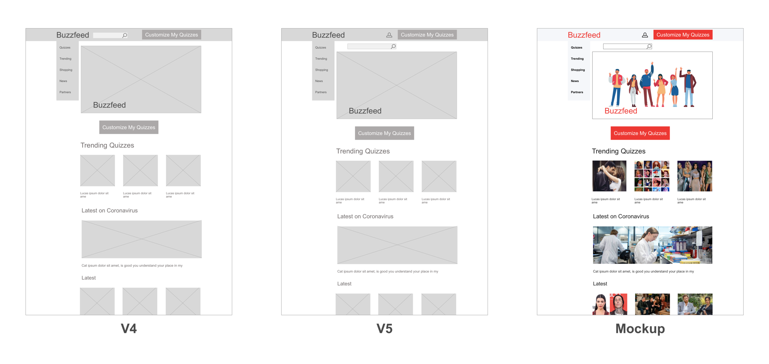
Tools: Sketch
A/B Testing on Quiz Option Wires
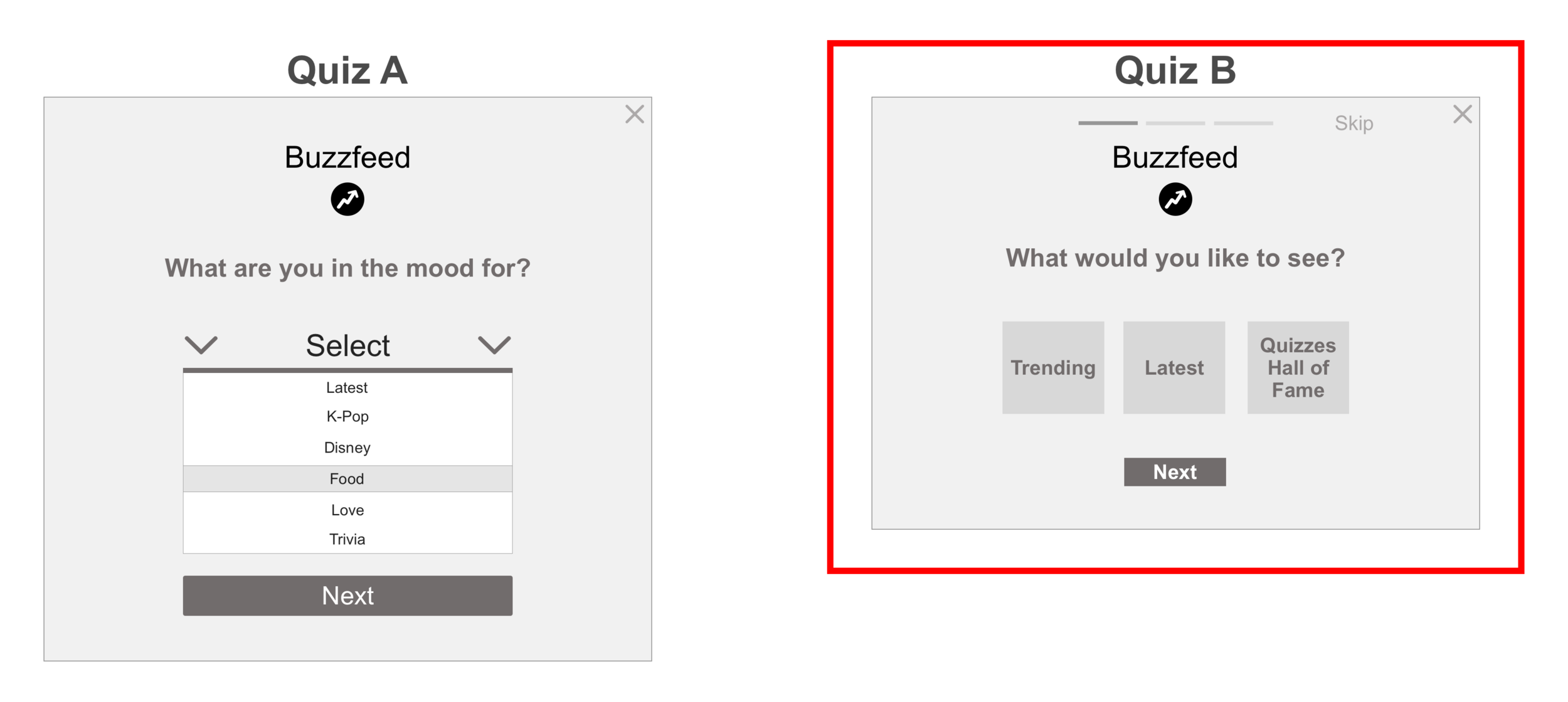
5/5 users preferred Quiz B because of its minimalistic design and fewer choices to answer. For this reason, it was a clear decision to keep Quiz Option B for the mockup version.
Launch
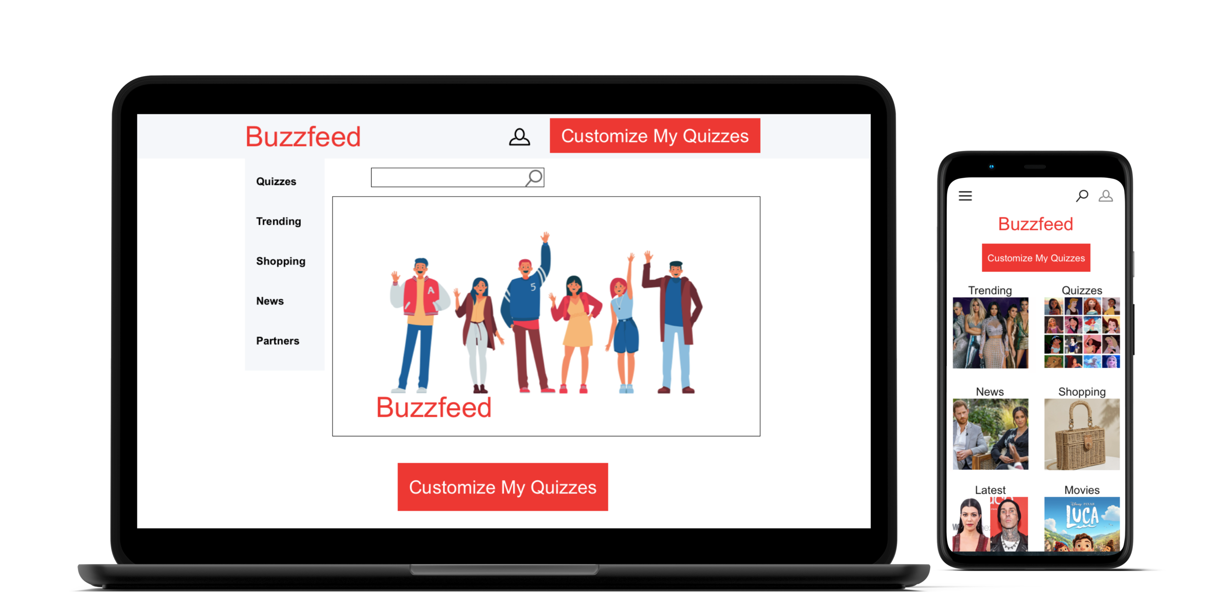
Mockups
Tools: Sketch, Invision, and Keynote
Annotations
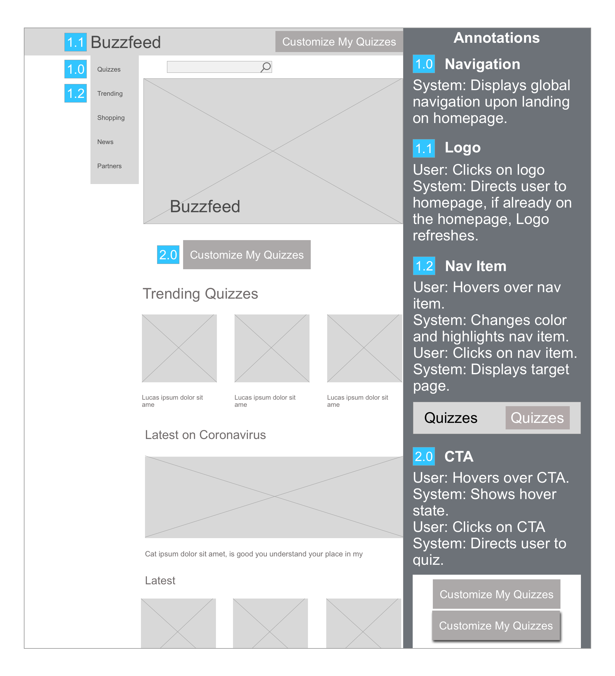
Tools: Sketch
The wireframe annotations here are given to the developers to explain the wireframe functions.
What’s Next?
Stay tuned! Developers are currently in the makes of redesigning Buzzfeed the mobile version.